
I’ve been watching Mad Men again recently; binge-watching episodes in the evenings as I list eBay. The last time I watched it, it was pretty much when everyone else seemed to be watching it (certainly everyone online, at least) and it was before we had kids: our house was tiny and filled with loads of retro stuff. I used to love finding bits and bobs that reminded me of things I’d seen on the programme, and I desperately wanted to look and dress like Joan. Most of the time nowadays, I’m more of a season 1 Peggy….
It has prompted me to dig out my old magazines again – along with receiving the book Lifestyle Illustrations of the 1950s from Aidan for my birthday. I love, love, love vintage illustrations, particularly from the ’50s and ’60s. I can spend hours reading the old Woman’s Own mags and researching the illustrators. This issue, from May 29th, 1952, has two especially good illustrations for the main stories. One by Kenneth Kirkland, and the other by Coby Whitmore (one of my favourites!)

Kenneth Kirkland created this beautiful illustration for a short story by Rowan Ayers. It’s a story about a young girl who gets a job aboard a ship. Inevitably, she falls in love with the man who seems to dislike her (it always happens like this in these stories). They’re nearly always a re-run of the same storyline, but I still enjoy the easy fun of reading them.
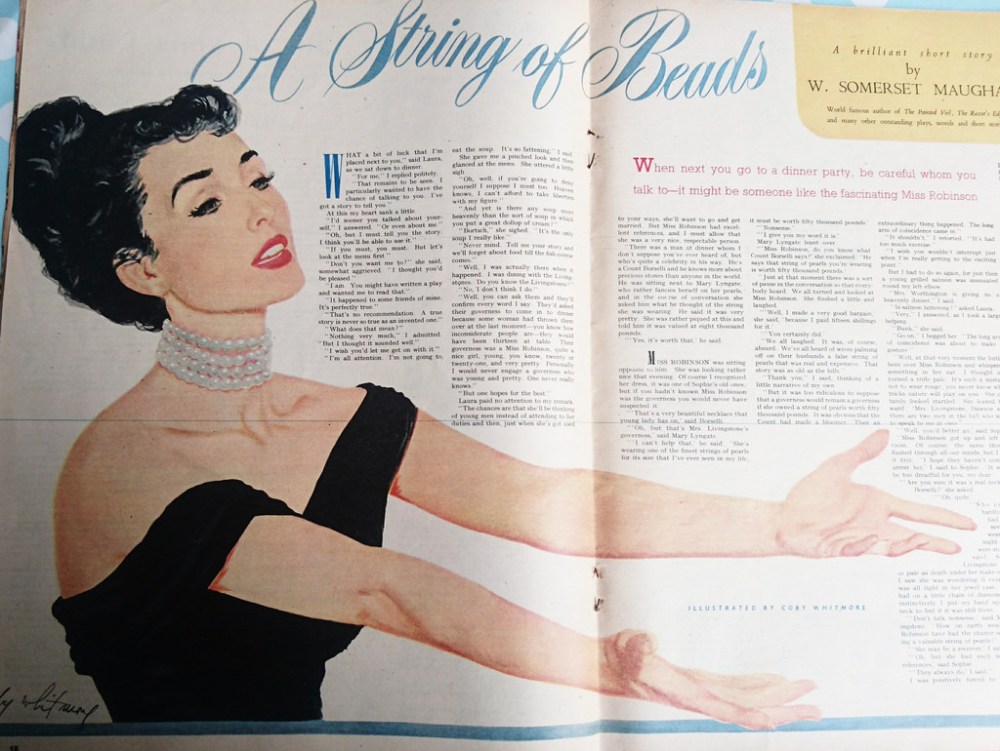
That picture is one of my favourites, one of the most interesting I’ve seen for a while. It amazes me that I still find copies I’ve still not read, but then I have got over a hundred of them. It’s interesting that W. Somerset Maugham is an author who occasionally appears in Woman’s Own – there are a few authors of note who make an appearance.
Apart from the gorgeous story illustrations, there are always some interesting adverts to see. Because the magazine is aimed at women, particularly house wives of the time, most of the products advertised are stereotypically feminine. Shoes, cosmetics, clothes, babies, medicines, food… I do think, what did women who wanted something different from those things read? Was there anything available at the time? Obviously, those subcultures existed but I’d like to know where.


I love some of the double entendre within the adverts from this time. The names are often so literal too: ‘Angel Face’ is a good example. The adverts seem to come in one of several types: the ones above create a ‘pretty’ image with the impression of ‘use this product and you’ll be as beautiful as this’. Then there are the adverts that are more literal with the truth about what the product will do:

You got that? You can keep your own natural teeth all your life, if you look after them. You wouldn’t think it would be in any doubt? And once you’re in the habit of brushing those teeth regularly, make sure you tint your gums to really show them off:

Apparently, Myrtle Crawford is ‘an enthusiast for the new fashion of rose-tinting the gums’. This miracle toothpaste promises to clean and polish your teeth and ‘impart’ a ‘delicate rose-tint’ to the gums. Amazing. I’d deduce from the use of the word ‘impart’ that there was probably a distinct lack of any rosiness transferring onto anyone’s gums with this.
Rowntree’s adverts often appear in Woman’s Own, and they always stand out with their colourful and vibrant images.
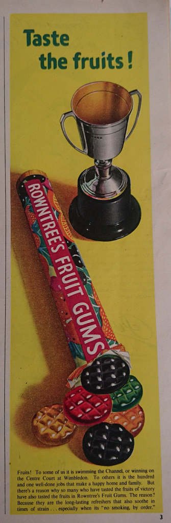
If you can read the text, it suggests that these should be used to ‘soothe in times of strain… especially when its “no smoking by order”‘. So, not just sweets for kids then.


These are particularly Mad Men-esque. Peggy would be all over those accounts.
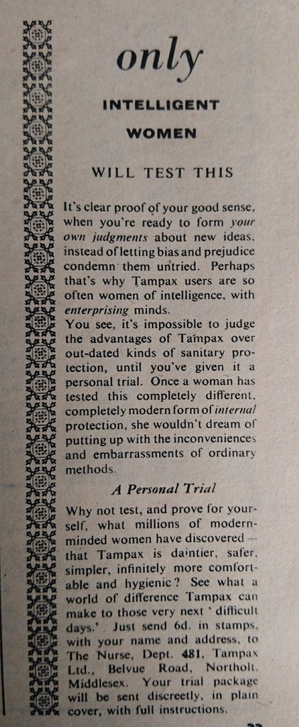
This next advert is printed in the corner of the page, almost as small as it can be. Turns out, in 1952, it wasn’t really the done thing to emblazon Tampax across a page:
One of the regular articles is where they have a doctor explain a medical issue for the readers. The one from this issue covers that common mid century cure of shock therapy:
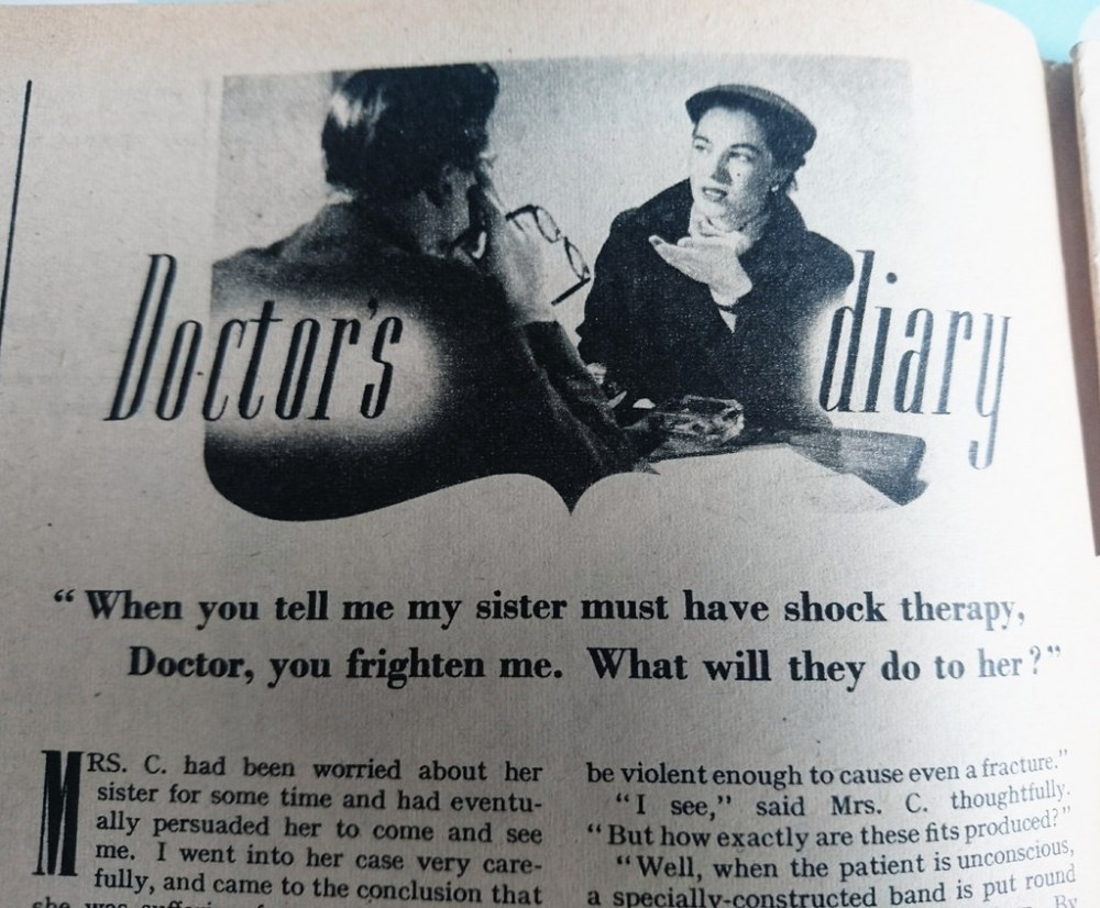
It explains the different types of shock therapy on offer, including shock therapy which induces a series of epileptic type fits or insulin therapy, which only puts you into a little bit of coma…
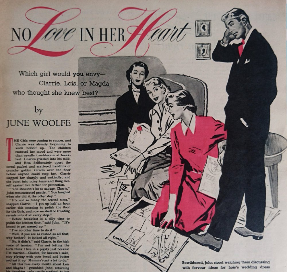
Poor John, it must be so difficult to understand them when they’re discussing with ‘fervour’ especially when it’s about wedding dresses. His poor ears.
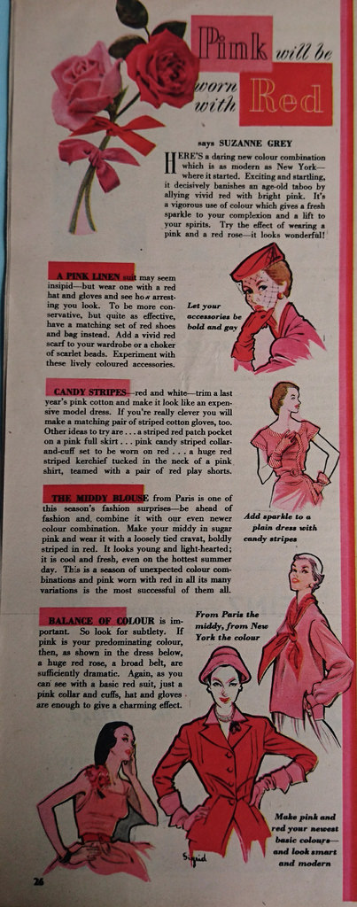
I wish pink and red were the colour combination of choice for 2017. I’m so bored of seeing beige and ‘rose gold’ on everything.
Well, my meander through the pages of Woman’s Own is done for another day. Back to the real world of washing, kids and cooking… have the last seventy years really changed so much after all?

Thank you for sharing your recent glance at you ‘Woman’s Own’ magazine collection Emma. Did you read any of the Patience Strong poems too? Kind regards, Andrew.
Hi Andrew, I did read the poem – a rather sombre one on bereavement. Could you send me your email address again and I will send you pictures of the ones I have from ‘current’ editions on my reading list. Hope you’re enjoying some lovely weather down in Cornwall. We’re visiting the area ourselves in a few weeks’ time and I can’t wait! Kind regards, Emma